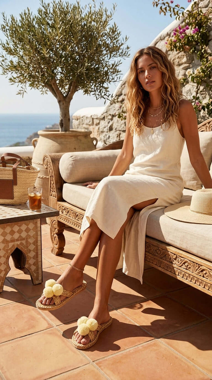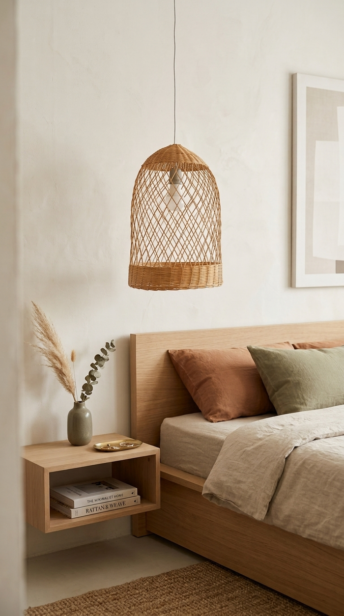


Boho Color Palette – 8 Colorful Schemes for a Boho-Chic Home (2026)
Bohemian style, or 'Boho,' is all about self-expression, creativity, and a free-spirited vibe. If you're looking to bring this eclectic style into your home, one ...

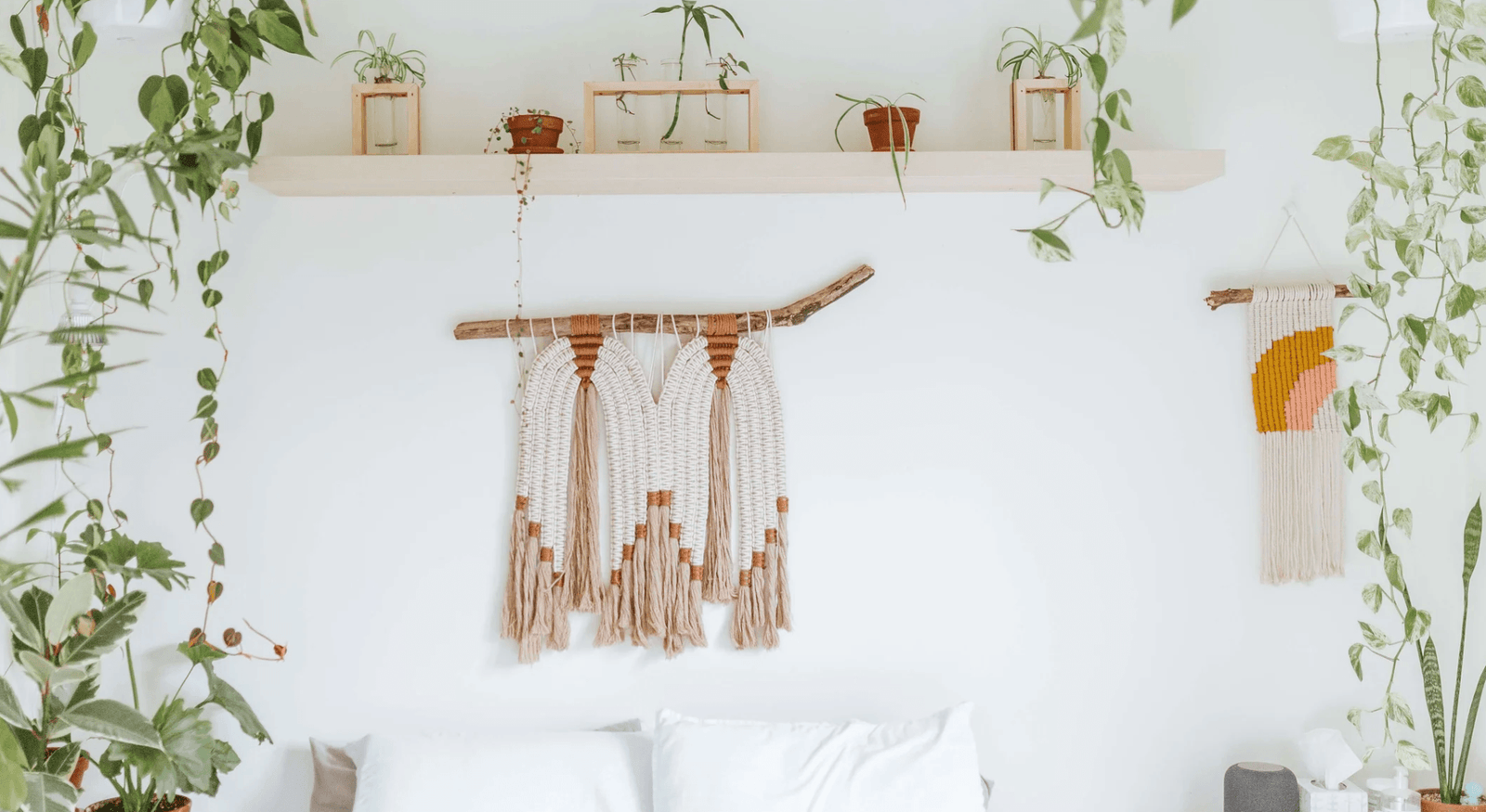
Bohemian style, or boho, is all about self-expression, creativity, and a free-spirited vibe. The fastest way to bring it home is with the right color palette. Below are 8 boho color palettes, each with real hex codes you can copy straight into a paint app or mood board, plus simple tips for living rooms, bedrooms, and choosing your own scheme.
What are boho colors? Boho colors start with an earthy, nature-inspired base such as terracotta, warm brown, cream, and ochre, then layer in richer accents like jewel tones or global-inspired brights. The look is warm, grounded, and collected over time rather than matchy or minimal.
Here are the 8 palettes we cover:
- Earthy warm neutrals
- Bold jewel tones
- Soft boho pastels
- Warm monochrome
- Tropical oasis
- Desert sunset
- Eclectic maximalist
- Moody and mysterious
1. Earthy Warm Neutrals
Embrace nature with warm, earthy tones like deep brown, sandy beige, and terracotta. These neutrals create a cozy, inviting base that feels like the heart of boho style. Mix in woven textures and layered patterns to add depth so the calm palette never reads flat.
- Terracotta #C66B3D
- Warm Brown #6F4E37
- Cream #EDE0CC
- Sandy Beige #D8C3A5
- Ochre #C8963E

2. Bold Jewel Tones
Make a statement with rich jewel tones such as emerald green, sapphire blue, ruby red, and amethyst. These saturated colors bring life to a room and look striking against an earthy backdrop. Pair them with brass or gold accents and eclectic decor for a deep, luxe boho feel.
- Emerald #0B6E4F
- Sapphire #1F4E8C
- Ruby #9B1B30
- Amethyst #6A4C93
- Gold #C9A227

3. Soft Boho Pastels
For a softer boho look, reach for gentle pastels like blush pink, sage mint, and pale lavender over a warm cream base. These delicate hues feel calm and serene while still keeping that collected boho charm. Layer in different textures so the soft palette stays interesting rather than sweet.
- Blush Pink #EBC8C4
- Sage Mint #BFD3C1
- Pale Lavender #D8CCE8
- Warm Cream #F3ECE2
- Dusty Blue #A9C0CE

4. Warm Monochrome
Choose one warm color and build with its lighter and deeper shades for a calm, cohesive space. A tonal run from off-white through oatmeal, camel, and chocolate adds real depth without ever feeling busy. Finish with a few contrasting accents and natural materials to keep it firmly boho.
- Off-White #F5EFE6
- Oatmeal #E4D8C4
- Camel #B08D57
- Taupe #8A7A66
- Chocolate #4B3A2F

5. Tropical Oasis
Bring in a vacation mood with lush palm greens, ocean blues, turquoise, and a hit of coral. This lively mix feels carefree and fresh, perfect for a sunroom or a bright living space. Layer in natural textures like rattan and woven fibers to ground all that color.
- Palm Green #3E6F52
- Ocean Blue #2A7B9B
- Turquoise #4CB5AB
- Coral #E5735B
- Sunny Yellow #E7C24F

6. Desert Sunset
Take inspiration from a desert sunset by blending burnt orange, golden yellow, and dusky pink over a clay and sand base. This palette feels warm and romantic, ideal for a cozy boho sanctuary. Southwestern patterns and layered cushions push the mood even further.
- Burnt Orange #C65D34
- Golden Yellow #E0A94A
- Dusky Pink #C98A87
- Clay #A0522D
- Sand #E6CFA8

7. Eclectic Maximalist
Why pick one palette when boho lets you have them all? Mix magenta, teal, mustard, and cobalt with fearless pattern and texture for a room that feels layered and personal. The trick is a shared warmth across the colors so the whole space still hangs together.
- Magenta #A6317F
- Teal #1C7C7C
- Mustard #D19A2B
- Cobalt #2F52A0
- Coral #E5735B

8. Moody and Mysterious
For a more dramatic boho, go deep with charcoal, midnight blue, and rich burgundy grounded by forest green. These moody shades create a cozy, sophisticated retreat, especially in a bedroom or reading nook. Add plenty of texture and a little brass so the darkness still feels warm.
- Charcoal #36454F
- Midnight Blue #1B263B
- Burgundy #6E1F2A
- Forest Green #2F4030
- Brass #B08D3F

Boho Color Palette Cheat Sheet (with Hex Codes)
| Palette | Main Colors | Accents | Hex Codes |
| 1. Earthy Warm Neutrals | Brown, Beige, Cream | Terracotta, Ochre | #C66B3D #6F4E37 #EDE0CC #D8C3A5 #C8963E |
| 2. Jewel Tones | Emerald, Sapphire, Amethyst | Ruby, Gold | #0B6E4F #1F4E8C #9B1B30 #6A4C93 #C9A227 |
| 3. Soft Pastels | Blush, Mint, Lavender | Cream, Dusty Blue | #EBC8C4 #BFD3C1 #D8CCE8 #F3ECE2 #A9C0CE |
| 4. Warm Monochrome | Oatmeal, Camel, Chocolate | Off-White, Taupe | #F5EFE6 #E4D8C4 #B08D57 #8A7A66 #4B3A2F |
| 5. Tropical Oasis | Palm Green, Turquoise, Yellow | Ocean Blue, Coral | #3E6F52 #2A7B9B #4CB5AB #E5735B #E7C24F |
| 6. Desert Sunset | Burnt Orange, Gold, Clay | Dusky Pink, Sand | #C65D34 #E0A94A #C98A87 #A0522D #E6CFA8 |
| 7. Eclectic Maximalist | Magenta, Teal, Mustard | Cobalt, Coral | #A6317F #1C7C7C #D19A2B #2F52A0 #E5735B |
| 8. Moody and Mysterious | Charcoal, Midnight Blue, Burgundy | Forest, Brass | #36454F #1B263B #6E1F2A #2F4030 #B08D3F |
Boho Colors for the Living Room
Living rooms suit a warm, welcoming base, so start with cream, oatmeal, or soft terracotta on the walls and larger pieces. From there, layer in one or two richer accents such as rust, mustard, or deep teal through cushions, a rug, and art, and let natural materials like rattan and wood carry the texture.
If your living room gets a lot of light, the earthy neutrals and desert sunset palettes glow beautifully. For a cozier or north-facing room, warm monochrome or a touch of jewel tone keeps things intimate without feeling dark. For more room-by-room ideas, see our guide to boho interior design.
Boho Colors for the Bedroom
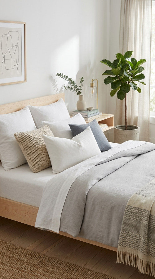
Bedrooms are where softer boho palettes really shine. Blush, sage, warm cream, and dusty blue create a restful mood, while a warm monochrome scheme in oatmeal and camel feels calm and grounded. Keep the boldest colors to smaller doses like a throw or a lampshade so the room stays easy to sleep in.
If you love drama, the moody palette works well in a bedroom when you balance the deep shades with plenty of texture and a warm metallic. Terracotta and clay tones are another favorite here, adding warmth without the energy of brighter hues. Our post on boho paint colors has specific shades that work on bedroom walls.
How to Choose Your Boho Color Palette
The easiest way to build a boho palette is the 60-30-10 rule. Give about 60 percent of the room to an earthy base color like cream, beige, or soft terracotta on the walls and big furniture. Use around 30 percent for a secondary tone such as a warm brown, sage, or clay through your sofa, rug, or curtains. Save the last 10 percent for a bold accent like emerald, rust, or magenta in cushions, art, and small decor.
Pull your colors from something you already love, like a rug or a piece of art, so the scheme feels personal rather than picked from a chart. Stick to warm, nature-inspired versions of each color and repeat every accent at least twice around the room. That repetition is what makes a boho space feel collected instead of chaotic.
Is Boho Still in Style in 2026?
Yes. Boho is very much in style in 2026, it has just grown up. The current direction is softer and more grounded, leaning on earthy neutrals, terracotta, and warm wood tones with fewer loud brights and a bit more restraint. Think refined and layered rather than busy, with natural materials doing most of the work.
That shift is good news if you want a look that lasts. An earthy, texture-led boho palette reads as timeless, so you can add or swap accent colors over the years without redoing the whole room.
Bring Your Boho Palette Home with Natural Texture
Color sets the mood, but texture is what makes a boho room feel real. Once you have a palette, the fastest way to bring it to life is with handmade, natural-fiber pieces that add warmth and shadow. A few well-chosen items in your accent colors do more than any single big purchase.
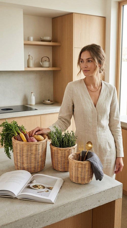
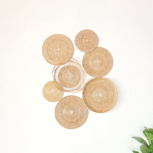
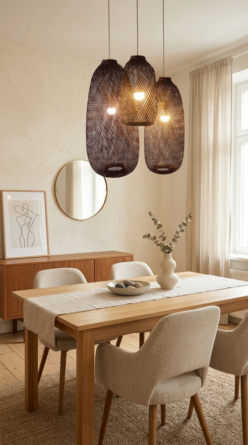
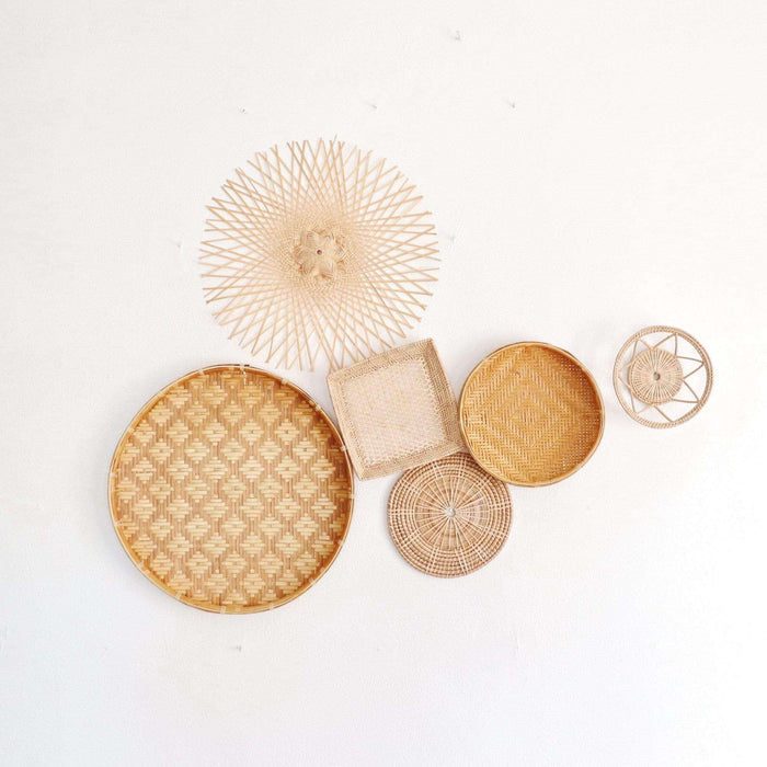
Start with our rattan wall decor to add woven texture and warmth to a bare wall. Layer in handmade throw pillows and Thai triangle cushions to carry your accent colors across a sofa or bed. Finish with rattan pendant lights or a set of woven storage baskets to fold in that earthy, collected feel from floor to ceiling.
Frequently Asked Questions
What are considered boho colors?
Boho colors are warm and nature-inspired. The base is usually terracotta, warm brown, cream, beige, and ochre, layered with accents like jewel tones, rust, mustard, teal, or global-inspired brights.
What are the earthy boho colors?
The core earthy boho colors are terracotta (#C66B3D), warm brown (#6F4E37), cream (#EDE0CC), sandy beige (#D8C3A5), and ochre (#C8963E), often paired with clay and olive green.
How do I choose the right boho colors?
Use the 60-30-10 rule: an earthy base for 60 percent of the room, a secondary warm tone for 30 percent, and a bold accent for the final 10 percent. Pull the colors from a rug or artwork you already love and repeat each accent at least twice.
Is boho out of style in 2026?
No. Boho is still popular in 2026, just softer and more grounded, with earthy neutrals and natural textures leading the way over loud brights.
Embrace the boho spirit. With these eight palettes and their hex codes, you have everything you need to build a boho space that feels warm, personal, and uniquely yours. Pick the palette that speaks to you, layer in natural texture, and most of all, have fun with it. Happy decorating.
Handwoven pieces for this guide